Design Challenge: Design 21st Century Fox a New Logo!
In DesignCrowd's most recent community brand logo design contest, we challenged our designer community to re-imagine the new 21st Century Fox logo.
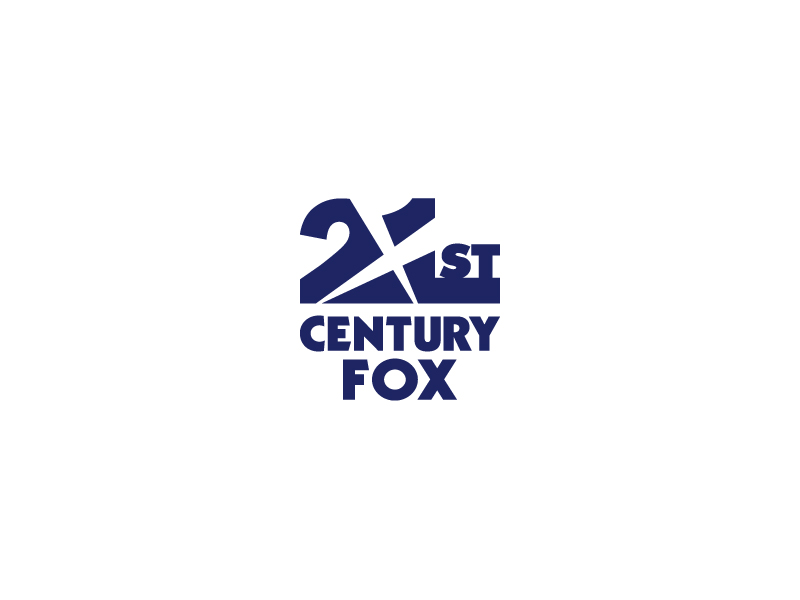
When Rupert Murdoch announced that News Corporation would be split into two separate companies last year, it was clear that it was a only a matter of time before a new logo would eventually be unveiled. On May 9, Rupert Murdoch launched a new logo for 21st Century Fox, the parent company of well-known entertainment brands like FOX network, 20th Century FOX, FX, among dozens of other channels.
The new logo has been designed as a business to business brand mark that links together core brand elements from existing brand marks (FOX network, 20th Century FOX, FX etc) such as the moving spotlights. Rupert Murdoch, CEO of News Corp, claimed that the new logo design "reflects the rich creative heritage" and reveals their "restless drive toward the future". The international design community was divided, with many designers unsure if the new logo delivered Murdoch's vision.
The 21st Century Fox logo.
Image source: UnderConsideration.com
Design Community Response
Industry website, Under Consideration, analysed the logo and received a stack of comments when it asked the community to comment on the new logo design.
Design Taxi:
"The new company logo is much like a minimalistic version of production studio 20th Century Fox’s logo."
Designers have also mentioned that the new logo is very similar to content production company Odyssey Creative’s brand mark. See their website to decide for yourself.
Others criticised the design by Pentagram for too heavily referencing the "creative" Fox heritage of the 20th century and producing a design that looks like an "old telecom logo from the early 80's".
Under Consideration:
"The logo does its job. It just happens to do it in a rather underwhelming way."
The Design Contest
Naturally, we thought this was a good opportunity to launch a design contest. Designers were invited to intepret Murdoch's vision for the parent brand and submit a new logo design. Our contest requirements asked designers to include the words "21st Century Fox" in the design and use the new brand colors: blue, black, grey, and white. The design had to align with other Fox brands to keep with the vision of the company. However, we did give designers the liberty to choose whether or not to stick with the existing logo look or to create something completely new.
The Prize: $500 Up for Grabs
We awarded $250 cash to the winner, $150 to 2nd place, and $100 to the 3rd place runner up. We received 103 amazing designs from 47 designers around the world, all designs except one design, referenced the famous spotlights, giving a nod to the heritage of the Fox entertainment brands .
The Winners
The top 3 designs used the spotlight elements. First place winner Stu Crew from the UK updated the font-type and described his logo as "Nevis font with iconic searchlights".
In second place is Indonesian designer Goh ranked 24th in the global designer rankings and recently interviewed for this blog, submited a two-colour design that used negative space using the spotlight element to highlight the company name "21st".
Peruvuan designer Rasecnovski centered his design around a circle (formed by a spotlight) to highlight the company name and an inverted color palette to exagerate depth of field.
Take a look and let us know what you think about our choice in winners!
1st Place | $250
|
 |
Stu Crew - United Kingdom |
 |
Designer comment: "Reinterpretation of the 21st Century Fox logo.
Nevis font with iconic searchlights."
|
 |
Goh - Indonesia |
 |
 |
workflow - Portugal |

|
Designer comment: "Always in the spotlight..."
|
Leave a comment below and give us your opinion on who you think the winning design should have been. Be sure to include a link to the design if it is not included in the list above. Think you can do better? Try our fox logo maker.
Community Contest: $1,000 iOS7 app design contest!
If you're interested in entering more community contests, check out a new contest:
$1,000 iOS7 app design contest that's open right now. We're on the look out for funny (LOL), satirical and genuine/serious designs. So rock out your iphone and think about how you'd change the new *new* iOS. And, don't forget there's prize money and exposure on offer too!
Jo Sabin is Head of Designer Community at DesignCrowd. She's led the company's public relations and social media programs since 2012. With more than ten years' experience working with Australian and international tech startups in the creative industries, Jo has been instrumental in meeting DesignCrowd's objectives in Australia and abroad. Get in touch via Twitter.
