When it comes to increasing conversions in any web-based sales funnel, much of the focus is usually on the copy - and rightly so, as that's where most of the heavy-lifting is done. But the design elements in your sales funnel play an important role as well, and small changes - such as the color of a call to action button - have been known to increase conversions by up to 20%.
Here are 10 design tweaks and techniques you can implement to start increasing conversions right away.
1. Three Pages in the Funnel
It's often tempting to split a funnel into as many pages as we can get away with - it gives us better measurements when using goal tracking software to measure how far in the potential customer gets. But more pages than are necessary is a bad move for conversions. Since we track visitors in order to improve conversions, it doesn't make much sense to split things up for tracking's sake alone.
Wherever possible, consolidate your sales funnel into just a few pages. Ideally, you'd have three: the sales page, payment processing and confirmation. If you're using a payment processor that adds more pages than are strictly necessary - perhaps PayPal - it might be worth looking at workarounds or alternate services.

2. Hardcore Page Optimization
Page loading speed is one of the leading causes of visitor attrition. Don't spare any effort on optimizing any part of your sales funnel, from the homepage to the sales page to the checkout.
There are a heap of easy ways to get started here. Use a CSS minifier, optimize your images with an app like ImageOptim (for Mac's) or Trimage (for Windows) - which gets file sizes down even further after you've used Photoshop's "Save for Web" feature - and get your designer to use sprites, which reduces HTTP requests by including all of your images in just one file.
There are more involved techniques for page optimization, and it's worth the money you'll spend on getting a developer to implement them. In the meantime, these techniques can be implemented within an hour.
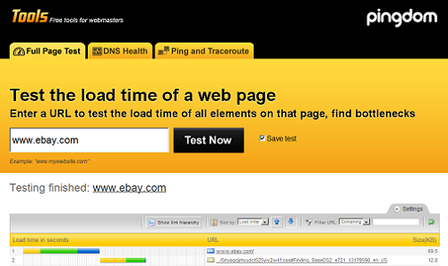
Use a tool like Pingdom to test the load times of your page and see how the changes you make affect speed.
3. Simplify Navigation
Your sales funnel should have only one direction. If you insist on having some sort of site navigation attached, make it simple. Don't provide any opportunity for visitor confusion. Use heat maps as supplied by services such as Google Analytics to see what your users are clicking on - if they're not heading down the funnel, you'll want to rethink providing those options on your sales page.
For sales funnels, the best kind of navigation is simply to the next step in the sales process. You can lose conversions far too easily by letting your visitors wander aimlessly.
4. Tweak Your Headlines
Whether the content of your headlines captures the attention of your visitors is up to the copywriter. Whether the visitor looks at the headline in the first place is part of the designer's job.
Copywriters use headlines to control flow and set the scene. Headlines need to be big enough to get the visitor looking at them to begin with, without looking gaudy - sales pages that scream `scam' just don't do well. Test size, font and color combinations.

5. Test Your Buttons
Buttons are a great way to attract attention to your call to action. But the design of a button in the context of the page makes all the difference to effectiveness.
You can test variants of size, color and location on the page. One of the controversial debates that has been raging over call to action buttons since the start of Internet marketing, though, is color.
Many people claim that there's one true color that works best based on psychological reasons, but hundreds of A/B tests by various companies have revealed that it has more to do with how the color contrasts with your color scheme than how the color registeres psychologically on its own. Try a few common colors - green and red, for instance - and see how they stack up for you. It might not be the color that everyone else insists is best, but you'll know it's best for your site.
6. Make Calls to Action Pop
Often the button is just one part of the call to action - placed at the end of a concise pitch to get the user to move on to the next step. The pitch that tops off your sales letter needs to pop out from the body copy as well. Experiment with borders, boxes with various background colors, font sizes and colors, and test until you find a statistically significant improvement (or decline, in which case you know you're testing in the wrong direction). You can also experiment with using web push notification as your CTA instead. You can use them to encourage people to check out your website or to show promotional offers or discounts.

7. Above the fold? Forget it.
The concept of `above-the-fold' applies to newspapers and getting them to move off stands. The fold is an idea that's based on the limitations of print media, and over ten years ago some schmuck decided to propagate the myth that web design should follow the same roles.
But users know how to use their scroll wheel, and cramming information ruins flow and readability. Use whitespace judiciously to create a seamless, one-directional flow from point to point in your copy. Modern page builders like Convertri understand this principle, offering capabilities that prioritize natural flow over rigid constraints. Let the copy do its job of getting the user to scroll and click on to the next page.
8. Choose Color Schemes with Meaning
Earlier I mentioned that individual call to action buttons have varying effectiveness based on how the color contrasts with the overarching color scheme. While this indicates that the meaning most people associate with the color doesn't matter (for instance, green for go and red for stop, as all users are familiar with traffic lights), it's a different story when it comes to the frame you create with the overall page color scheme.
Create a color scheme that will appeal to your target market according to color psychology conventions. For example, if you're running an operation in the food business, you might try combining shades of red and green (though I leave it to you to make that work without looking like Christmas). Red is known to get the appetite going and green indicates the freshness of food. On the other hand, you can also align your color scheme with your branding guidelines, like Jobber does in this Plumber Salary Guide. Everything from the stats, graphs, the map, etc., follows their recognizable branding.
9. Test Everything, All the Time
The golden rule of increasing conversions is to test everything, all the time. You should always be running some sort of multi-variant test, such as an A/B test. Sitting on your laurels after the first round of testing is throwing money away. Additionally, employing statistical hypothesis testing methodologies can help reduce type 1 and type 2 errors, ensuring more accurate and reliable insights for optimization strategies.
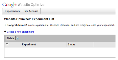
Set up an app like Google Website Optimizer that can handle the testing for you and iterate on your tests. When you run an A/B test that indicates option A incurred a decrease in conversions and option B increased conversions, the natural instinct is to stick with option B. What you should do next is to mark option A as a `steer-clear' idea and then try new variants in the direction of option B until you hit on diminishing returns.
10. Record Your Findings
This might not be something that you can get started with today, but make sure you keep all the data you collect from your tests. Next time you embark on a project you'll have a good foundation from which to start if you've kept the results from previous project tests, potentially saving you months. You'll also be able to put into place design guidelines for the operation you've been running all this time, so that new pages benefit from the extensive research you've done.
Of course, a great library of results and findings is no good reason to stop running new tests!
Written by DesignCrowd on Tuesday, May 17, 2011
DesignCrowd is an online marketplace providing logo, website, print and graphic design services by providing access to freelance graphic designers and design studios around the world.
