Traditional brand guidelines were designed for polished campaigns and tightly managed layouts where every detail could be art-directed. Elements like logo design were meticulously controlled, with strict rules about placement, sizing, and background colors.
Today, content creators give a different kind of life to your brand.
They post images and videos filmed in apartments, on sidewalks, under imperfect lighting, across dozens of creators you don’t fully control.
If you enforce your brand guidelines too rigidly, you slow production and make your creator content feel less native. If you loosen them too much, people might not remember or even recognize your brand.
That’s why you need visual systems strong enough to be recognizable, yet adaptable enough to survive platform-native content.
That’s exactly what you’ll learn in this article, so keep reading below.
Why Traditional Brand Guidelines Don’t Work in the Creator Economy
Traditional brand guidelines were built for centralized production and long campaign cycles. The creator economy runs on decentralized production and rapid iteration. When rigid systems collide with high-velocity content environments, friction appears almost immediately.
Here’s where it typically breaks:
1. Approval bottlenecks
Traditional brand governance assumes few campaigns with limited asset formats, and centralized creative production.
In the creator economy, that model collapses.
A single creator campaign can produce:
- 10-30 variations per concept
- Multiple platform cuts
- Real-time iterations based on performance
Now imagine taking every asset through a centralized review from brand, legal, and design. You’ll have a longer time-to-publish, lose creator momentum, and your content relevance will drop.
In environments like TikTok, where trend cycles can peak and decline within 48 hours, centralized approval models are operationally incompatible.
2. Slowed testing velocity
High-growth brands win through testing. In our experience, performance-driven organizations can run:
- 50-100+ creative variations per month in paid social
- Weekly landing page experiments
- Multi-format creator collaborations
But rigid brand guidelines introduce constraints such as fixed layouts, strict color ratios, mandatory logo placements, and non-negotiable typography scales.
Needless to say, this kind of rigidity for each variation makes experimentation very expensive and slow. As a result:
- Learning slows
- Optimization slows
- Growth slows
3. Creative fatigue
When every asset looks nearly identical, audiences recognize the pattern quickly.
Even strong branding can become visually predictable. Without built-in flexibility, the identity system doesn’t evolve alongside the content environment, and engagement begins to drop.
For example, cold-press juicer brand Hurom allows its creators to use different fonts, colors, and backgrounds in their assets. This reduces creative fatigue significantly.
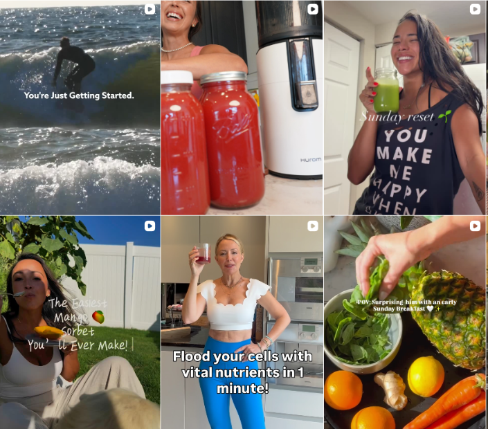 Image source
4. Loss of cultural relevance
Creator ecosystems reward:
- Native tone
- Platform fluency
- Cultural adaptation
- Personality
But traditional brand guidelines were built for controlled ad environments, broadcast media, and a static web presence.
When creators are forced to adhere to rigid aesthetic rules:
- Content looks like an ad
- Engagement drops
- Authenticity suffers
In other words, the more you enforce visual uniformity, the less native the content feels. But if you remove guardrails entirely, brand equity fragments.
This is the central paradox modern brand leaders must solve, and we’ll show you some solutions in the section below:
What a Flexible Visual Identity System Actually Means
A flexible visual identity system makes your brand instantly identifiable, even when execution varies. Plus, you reduce creative costs, adapt faster, and optimize learning.
Instead of forcing everything to look identical, we advise you to define what must stay stable across assets:
- Establish signature visual anchors. Choose 1-2 color accents, a recurring overlay style, or a distinctive framing device that appears consistently across formats.
- Define repeatable compositional patterns. Set preferred crop styles, text placements, product entry angles, or negative space usage that creators can replicate without rigid templates.
- Clarify your editing rhythm. Decide whether your brand feels fast-cut and energetic or steady and minimal, and document pacing expectations in your guidelines.
- Translate tone into visual behavior. If your brand is bold and direct, that may mean heavier typography and tighter cuts. If it’s refined and calm, that may mean lighter fonts and slower transitions.
For example, we don’t mandate a fixed background color in every creator video.
Instead, we can define a recurring color accent in text overlays or motion graphics. That allows creators to film naturally while still embedding a recognizable brand signal.
When audiences can identify the brand without seeing the logo, the system is working.
Dashing Diva does this well on TikTok. Creator videos vary in lighting and setting, but recurring pink tones and clean nail close-ups create instant brand recognition even before the logo appears.
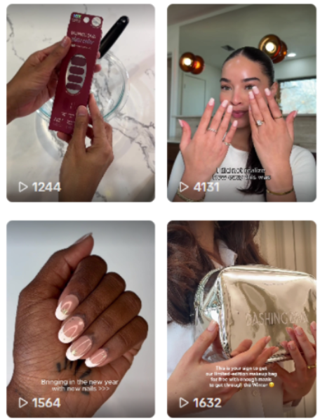 Image source
How To Turn Brand Guidelines Into Creator-Ready Assets
Now that you know why traditional brand guidelines don’t work and what a flexible identity system means, here’s how to tie it all together.
Build modular identity kits
Creator ecosystems require assets that can be reused, resized, and reassembled quickly across formats. A modular identity kit turns your brand’s guidelines into a working system that designers, editors, and creators can actually use without constant supervision.
To build one:
- Create remixable asset libraries. Move core brand elements into shared Figma libraries or a structured DAM system so content creators can drag, drop, and adapt them. That way, they won’t have to recreate anything from scratch. We advise you to include logos, as well as overlays, motion frames, text treatments, and product cutouts.
- Design logo variations for real platform formats. Prepare optimized versions for vertical (9:16), square (1:1), and story placements. You can use logo generators to move things faster. Next, test how they behave in corners, as watermarks, and within motion graphics. Testing them only on white backgrounds doesn’t give you the whole picture.
- Define flexible safe zones for cropping. Having just one clear-space rule feels too rigid. In our team, we define minimum visibility thresholds instead. These account for dynamic cropping in Reels, TikTok, and Shorts. The key is to make sure critical brand elements remain visible even when UI elements overlap.
- Pre-build format templates. Give content creators lightweight, editable templates for hooks, testimonials, product demos, and offer callouts. That way, creators (and even your internal teams) can adapt content quickly while keeping the same brand structure.
Pro tip: One easy thing you can test is to stop requiring a full logo lockup in every asset. Instead, you might define a simplified mark for watermark use in vertical video and a full lockup for landing pages. That small adjustment alone increases usability across creator formats without weakening recognition.
Create performance-ready typography systems
In creator-led and mobile-first environments, text has seconds to communicate value. If it’s hard to read, too thin, or visually competing with captions and platform UI, it won’t perform, even if you like how it looks in a guideline document.
A performance-ready typography system accounts for how people actually consume content:
- Design for three-second legibility. The 3-second test in UX design is based on the fact that you need to hook people’s attention fast or they’ll lose interest. So, test your headlines at small mobile sizes. If the core message isn’t readable instantly on a moving screen, adjust weight, contrast, or spacing.
- Account for burned-in captions and UI overlays. Leave visual breathing room at the bottom and edges of vertical video, where platform captions, usernames, and CTAs appear. If your type system can anticipate interference, it makes the whole system flexible and, as a result, scalable.
- Define mobile-first hierarchy rules. Specify minimum font sizes, line spacing, and maximum word counts for vertical formats. Unfortunately, desktop readability standards are not enough.
- Create bold and condensed variants intentionally. Short-form content platforms tend to reward punchy, high-contrast typography. Make sure your font family includes weights that can carry urgency without going against your brand tone.
For example, at inBeat Agency, we’ve seen refined serif headlines work well on website hero banners. However, in a TikTok testimonial, this kind of font may disappear against fast movement and compression.
In that context, you may need a heavier weight or simplified secondary type treatment to preserve the brand identity, while still keeping the text clear.
Evry Jewels adapts this well on TikTok. Instead of delicate serif treatments, they use bold, high-contrast, sans-serif overlays like in the example below to stay legible over movement and street-style backdrops.
 Image source
Define non-negotiables vs adaptable zones
Next, you should explicitly separate what must remain consistent in your brand guidelines from what can adapt across creators and platforms.
Non-negotiables can be:
- Core color anchors. Identify your brand’s color palette. These are the hues that must appear consistently, even if only as accents in overlays, text highlights, or motion graphics.
- Logo integrity. Specify minimum size, contrast requirements, and approved variations, especially for watermark or corner placements in vertical formats.
- Brand tone. Clarify how tone translates visually (for example, bold and direct vs. refined and understated). That way, it’s easier to align typography, pacing, and composition.
Then outline adaptable zones that allow execution to feel native:
- Backgrounds: Your brand signal doesn’t need a controlled set. In fact, it’s even better to let creators film in apartments, cafés, or sidewalks. After all, authenticity builds trust.
- Creator wardrobe: Avoid over-art direction unless the product category demands it.
- Shooting environments: Platform-native settings are better than a studio because they make the content feel more natural.
- Layout rhythm: Allow different text placements and pacing structures as long as your core anchors remain intact.
How To Transition from PDF Guidelines to a Living Brand System
Next, we explain how to transform your brand guidelines from a reference document into a functional infrastructure that supports distributed, high-velocity content production.
1. Audit your existing brand guidelines
Before building anything new, you need clarity on what you already have.
Most enterprise guidelines contain valuable strategic thinking buried beneath rigid execution rules. Your first step is to separate foundational identity from needless restrictions.
During the audit, review:
- Core brand principles and positioning
- Visual identity elements (color, typography, logo usage, imagery)
- Layout rules and template systems
- Motion and video guidance (if any)
- Tone of voice documentation
- Governance and approval processes
You are looking for two things:
- Which elements are essential to recognition?
- Which elements were created to control output rather than enable it?
This audit should involve brand, design, and marketing leads. If creator marketing is a priority channel, include that team early so the system reflects your real production needs.
2. Identify rigid constraints that slow production
Once you understand the current state, identify where friction occurs in practice, like:
- Mandatory layouts that do not adapt to vertical or short-form formats
- Fixed typography hierarchies that fail in dynamic content
- Logo placement rules that interrupt native storytelling
- Color ratios that restrict experimentation
- Approval steps that require brand sign-off for minor variations
Pro tip: Ask your design and social teams where they experience repetitive manual adjustments, and ask your creator managers what frequently triggers revision cycles. That way, you’ll find the problems faster.
3. Extract reusable brand primitives
At this step, you will move from documentation to system thinking. Primitives are the smallest reusable identity units that can scale across contexts, from Facebook, TikTok, to performance channels like app store ads.
Don’t think of them as “templates,” but rather as building blocks.
Examples of brand primitives include:
- A defined accent color system (that’s different than fixed color ratios)
- A flexible typography range
- Framing devices or graphic motifs that can adapt across formats
- Motion principles (speed, transitions, pacing)
- Tone markers that guide voice across platforms
For example, Coca-Cola’s brand primitives are extremely clear.
The red color field, the Spencerian script logo, and the dynamic ribbon device act as anchors. Campaign visuals vary across cultures, seasons, and formats, but those core elements remain intact. And people recognize the brand immediately because the primitives are consistent.
In the images below, you recognize Coca-Cola before you consciously read the logo. The saturated red immediately activates the brand’s primary color anchor, and the flowing white ribbon shape reinforces a familiar visual contour. Even across different cultural settings and subjects, the red field does the heavy lifting.
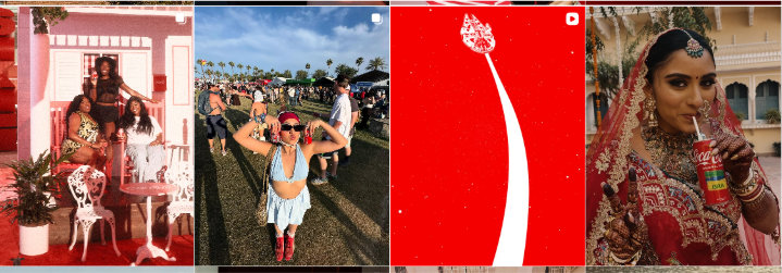 Image source
Basically, instead of having an “approved layout” you will have “approved components.” This builds a solid foundation for modularity because you gain clarity at the atomic level, so variation becomes safe.
That brings us to the next point:
4. Build modular components
With primitives defined, you can construct modular components that teams and creators can deploy without direct brand supervision.
These components may include:
- Flexible layout grids for vertical, square, and horizontal formats
- Pre-approved headline treatments that scale across content types
- Motion presets aligned with your editing rhythm
- Graphic overlays or lower-thirds optimized for short-form video
- Creator-ready asset kits that include adaptable brand elements
The distinction is important: modular components allow variation within structure, whereas templates do not.
The main advantage is that you reduce the need for manual brand intervention because compliance is embedded in the component itself.
5. Pilot with creator teams
Do not roll out the new system organization-wide immediately. Start with a controlled pilot.
Select:
- A high-volume content team
- A creator partnership initiative
- A specific product campaign
Now give them the modular components and observe how they use them.
Track:
- Reduction in revision cycles
- Time from brief to publish
- Volume of content variations produced
- Areas where creators feel constrained or unclear
This pilot phase will expose gaps that your internal brand teams may miss. Plus, content creators will test flexibility in ways your design team might not anticipate.
6. Iterate before full rollout
After the pilot:
- Improve components that created friction
- Clarify tone markers that were misinterpreted
- Adjust primitives that proved too restrictive or too loose
- Simplify access to assets if distribution caused confusion
After iteration, you can expand access across departments or external partners.
Remember: The system you just created is not the final document. Instead, think of it as an ecosystem you need to constantly maintain, albeit one that adapts to new formats, platforms, and branding trends.
The Future of Brand Systems Is Flexible by Design
In this article, we walked through what it really takes to move from static brand guidelines to a system that actually works in creator environments. We looked at why rigid rules slow you down, how to identify your true brand primitives, and how to turn them into modular, usable assets instead of locked PDFs.
If you want one practical way to start, run a simple test: remove the logo from a few recent creator assets and show them to someone unfamiliar with the campaign. If they can still guess the brand based on color, tone, and composition, your system is doing its job. If they can’t, that’s your signal to refine the anchors.
Remember: A flexible identity doesn’t mean you’re giving up control. Look at it as designing something strong enough to hold its shape, even when the execution changes.
Written by DesignCrowd on Friday, March 20, 2026
DesignCrowd is an online marketplace providing logo, website, print and graphic design services by providing access to freelance graphic designers and design studios around the world.
