The mouthwatering flavor-packed Doritos chip we know today has been around since the 1960s. It got its start at Disneyland, where the Casa de Fritos or Rancho Del Zocalo today was located. The product swiftly grew its popularity and became the sensation that it is today.
We’re paying homage to this irresistible snack by taking a look at the Doritos logo history. You will learn how the brand manages to keep its identity as crisp as ever with the help of logo design.
Learn more about the snack logo of the top-ranked chip brand in the US. Take a look at the overview of topics we’re tackling today.
Meet the Designer
Doritos worked hand in hand with design firm Hornall Anderson. You may know this firm as Sid Lee. In 2020, it was acquired by the company that has been around since 1993.
The firm is responsible for bringing the iconic logo we see in grocery and convenience stores. It also worked on redesigning the packaging with globalization in mind.
To achieve their objectives, the two companies surveyed different people worldwide and found that the brand must be transformed into something dynamic and bold. This inspired the brand’s move to create a chip logo that embodies this. Check it out in the section below.
The Timeline
Both the new and old Doritos logo will amaze anyone. The brand has consistently used out-of-the-box concepts to stay relevant and maintain its spot as the top tortilla brand.
Let’s take a journey and take a look at its various logo redesigns.
1964

Believe it or not, the very first iteration of the Doritos logo featured rectangular shapes instead of the triangle logo we see today.
Every letter of the brand name is encased in a vertical rectangle. They are arranged in a way to create an alternate pattern. It also uses fun and bright colors such as orange and yellow, which are known to encourage the appetite among consumers.
1973

In 1973, as the brand began to gather more traction, it decided to create a better contrast in its logo by changing up the color. The text remains similar to the first logo, but this version now has more yellow shades, and the text is in a browns color.
1985

The brand incorporated more colors into its logo. It used a reddish shade of orange to alternate with the bright yellow shade. Additionally, the brand also changed the letter i’s dot with a triangle shape to reinforce its product.
1992
Dorito is a portmanteau or combination of Spanish words, doradito (little fried and golden thing) and dorado (fried and golden). It is arguably one of the most recognizable triangle logos in the world. The year 1992 was when the brand first introduced a triangle logo.
2000

The 2000 logo introduced a cooler touch to the logo. Literally. It added a blue border to emphasize the chip-shaped frame that encases the brand name typography. This old Doritos logo looks like it has similar elements to the brand mark we see today.
2004

With electrifying line art, the brand manages to pull off an energetic brand identity. It also looks like sound waves representing the noise the crunch makes once you bite into their chip.
2013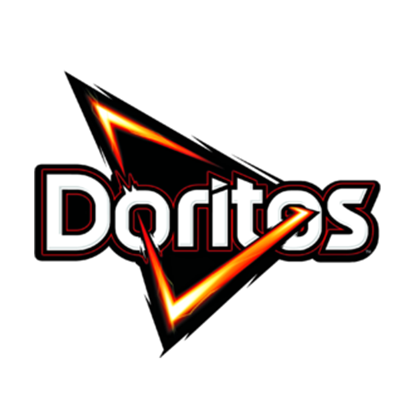
The chip company worked with a design firm to help usher their brand into an era of boldness and greater relevance. To achieve this, the brand redesigned the logo to make the triangle shape pierce through the two-letter Os. It creates a dynamic look that works well in changing the way the brand looks.
Conclusion
Whether you are running a snack company or a full-blown restaurant, you can use graphic design to appeal to foodies all over the world.
Like Doritos, you can associate your tasty offerings with a food logo design. Your audience can immediately connect with it and create a great impression.
One way for you to find the perfect design for your brand is by starting a logo design contest. Crowdsourcing platforms such as DesignCrowd allow you to work with an established community of freelance graphic designers. Get up to 50 designs to choose from today. You can even browse through the community and tap a designer that you most prefer.
The BrandCrowd logo maker is a great alternative for people who are looking to DIY their branding.
It empowers anyone to create a compelling brand even without the need for design experience. The maker offers a library full of customizable designs that are perfect for food truck logos, snack logos, and more. Try it right here.
Read more articles on design and inspiration:
Written by DesignCrowd on Monday, March 8, 2021
DesignCrowd is an online marketplace providing logo, website, print and graphic design services by providing access to freelance graphic designers and design studios around the world.
